
Over the last couple of weeks, my role in the Going Live project increased significantly, and then stopped completely. All of the animated shots had lighting added, and then I added the render layers/passes and started feeding completed shots through the render farm (which was considerably faster than I expected it to be). Sound effects and music were then added by the sound team, creating our finished advert.
It took a long time to get there, and there were problems along the way, but I learned a lot (particularly about rendering and compositing) and I am glad we all got there in the end! Next week, we are due to meet with the company in their London studio and present our finished project - hopefully the feedback will be good!
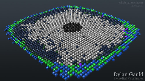
As for my cell visualisation work, this has been making good progress since my role in Going Live has lessened.
The first data-set I was working with, which represented cells and fibres in 2D space, now has fully working scripts, which are streamlined to work efficiently (or to actually work at all!). I am currently awaiting feedback on the video outcome of this work, so that I can decide where to take this next.
The other data-sets (involving cells, blood vessels, and oxygen density maps) have made even better progress. Again, after optimising my MEL scripts, the amount of data (several million lines of information) has become manageable, although time-consuming to process. I am currently part of the way through 'translating' this data into Maya's 3D environment.
An example render from the cells file can be seen below. This example frame is approximately two thirds of the way through the cell data, and incorporates some 'noise' on the cell surfaces to break up the uniformity (an idea suggested by the mathematician who provided the data);
As for the oxygen density, I decided to continue using a single polygonal plane for this, with grid points in the data having a matching vertex on the 3D geometry. The data then lifts/lowers each grid point/vertex between 0 and 1, where 1 is the most dense area of the oxygen 'clouds'.
The 'look' of these clouds is then controlled using one of two shaders.
Shader 1 ("Clouds") is coloured white, and uses a vertically-aligned ramp shader for it's transparency value, where 0 is fully transparent and 1 is fully visible. This means that as points on the vertex grid are changed in the Y-axis, their transparency is also changed (as they are moved higher, they become more visible).
Shader 2 ("Bands") expands upon this idea, and uses a second ramp for the colour (from blue to red, low to high). The transparency ramp is also 'sliced' into bands which are evenly spaced vertically - this means that only the narrow bands are visible, giving us slices of colour (where the colour is defined by where the slice falls on the colour ramp, rather than a fixed colour). This gives a result similar to the high/low pressure bands which weather presenters often use, but with colour added.
I have included a video below, which better explains these shaders - the white 'cloud' is shader 1, and the coloured 'bands' are shader 2;
Although this video shows a top-down view of the scene, it is important to remember that these effects are generated in 3D - moving forwards, I could include moving camera or changing points of view to highlight particular events.
Also, the oxygen density visuals are considered another 'layer' which I can add to the cells and blood vessels, creating a more complete final output.
I am not sure as to how this final output will look at the moment, as I am still developing the visual elements of each of the data-sets, but progress is good and things are at least working now...
No comments:
Post a Comment