As part of the visual development of my project, I have started to explore different styles which could be used to present the outcomes of my technical development.
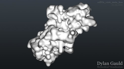
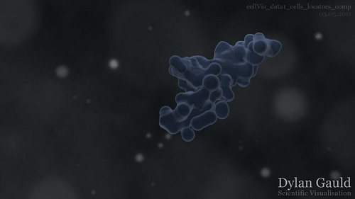
Using the final frame (1900) of one data-set, Adobe Photoshop was used to create several concepts, each of which present the data in slightly different ways. To highlight the differences, this first image shows the style of a very early render, followed by a more recent version (achieved mainly through compositing - more information can be found in a previous post here);
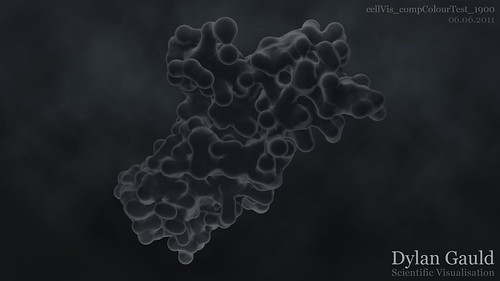
The first of these newer examples (below) tries to maintain simplicity. Although similar to the previous examples, there is nothing going on except the cells growing and expanding, forcing the viewer to focus on this and only this.
I have also chosen to remove the blue colour from the cells, and instead apply a saturated grey colour - this colour choice is much darker and aligns itself more with the fact that it represents the growth of cancer, a potentially fatal condition. This new colour also suits the new background better, whilst still being clearly visible (due to the whiter edges on the cell surface).
From a technical perspective, the gradient background was removed, as this caused problems with banding once compressed. By adding a 'cloudy' background with a small amount of animation (as a final sequence could have) it would minimise visual defects. A subtle vignette was also added, helping to maintain the viewer's focus in the middle of the frame;
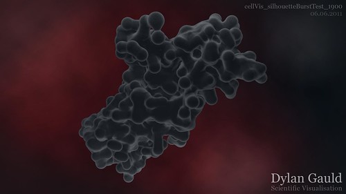
The next example uses the same cell appearance, though just with a different background. The background style was inspired by the images here, although has been modified slightly to suit my own tastes. This contrast between the cells and the background, makes the content stand out more - also, the background could potentially be animated (the 'light bursts' could move and/or change colour over time);
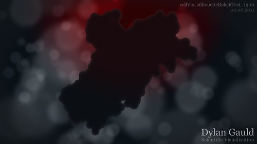
Finally, I wanted to toy with the idea of using negative space (particularly as cancer is something which cannot be 'seen' naturally). So far, the styles created have concentrated on what we can see - instead, I wanted to create an image which had a focus on what we can't see (similar to using a silhouette cut-out). The idea behind this third attempt, is that the background bokeh-style effects could be animated and moving around slowly, but the cell growth would still be happening in the front of the frame. I have also previously conducted experiments, which could enable this background to gain motion (found here).
These ideas have been developed as still images, although they could also be created as animated sequences. By creating images first, it acts as a 'prototype' and lets me see how the final result could look. Moving forwards, I plan on creating more images first and fully exploring the different looks that could be achieved. Once a final style (or more than one) has been chosen, I can then create that as an animated sequence.

No comments:
Post a Comment