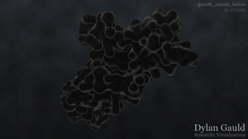
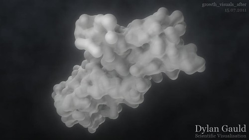
Now that the timing and content is close enough to being finalised, I have spent some more time polishing the visual style of the cells.
Feedback has shown that the visuals are a bit 'murky' at the moment, and there needs to be more definition - something to make the cells 'pop' and stand out. The cells move in a really unique and interesting manner, so it is important that this is the focus of the viewer (so that all my hard work can be seen!).
My project supervisor suggested I take a look at a DVD in the library by Jeremy Vickery, titled "Practical Light and Colour" (more information here). This DVD discusses the fundamentals of light and colour, and how a better understanding can improve practical work. If anything, it serves as a fresh source of ideas and inspiration, which will hopefully develop my cell aesthetics and drive towards the best outcome possible.
After watching this DVD, I started experimenting with colours and light in Maya, trying to develop something which was much more interesting, less murky, and had more focus on what I wanted the viewer to see.
Below are two renders; the first showing a still from Growth before this DVD/experimentation, and the second showing a new version, which uses entirely new lighting, colours and Maya shaders to give a different style completely.
I have yet to test this new style on an animated sequence, but I definately prefer the clarity that this updated version offers. The cells have significantly more contrast (against the background) and are less flat - by adding an edge glow, they really draw the viewer's attention.


1 comment:
I love the second one! Way more visible and gives a much better idea of the form. The shader and the glow also give a really distinctive look.
Post a Comment